
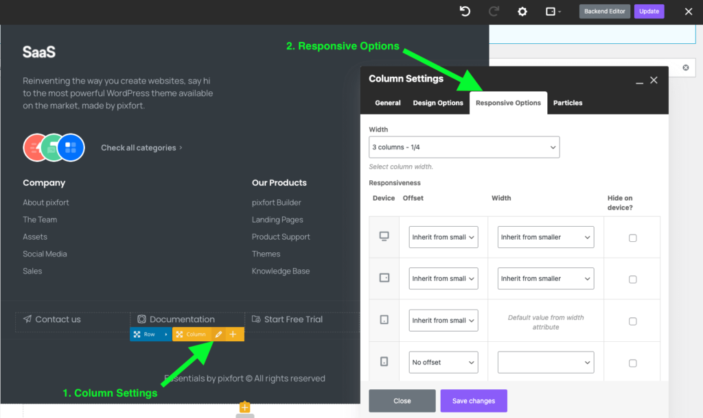
In WPBakery, you can control the width/offset/visibility of the columns across different screen sizes from the responsive options tab, for more information you can check this article from WPBakery knowledge base:
https://kb.wpbakery.com/docs/learning-more/responsive-settings/
For example:
The Responsive options tab in Columns is a WPBakery default functionality (it’s not part of the theme) and it’s available to control columns, for more information about Responsive options in WPBakery you can check their documentation from here:
https://kb.wpbakery.com/docs/learning-more/responsive-settings/
Note: sections and rows in WPBakery page builder are basically composed of columns and you can control the visibility of sections and rows by controlling the columns. For more information on WPBakery page builder concept you can check their articles from here
https://kb.wpbakery.com/docs/learning-more/basic-concept/
CSS Classes to control responsive visibility
If you want to display a section/row only on Desktop, open the Section/Row settings in WPBakery and add the following classes in the Extra class name field:
d-none d-xl-flex
To hide a section/row only on Desktop (and display only on tablet and mobile) open the Section/Row settings and add the following classes in the Extra class name field:
d-inline-flex d-xl-none
To hide a Section/Row on desktop and tablet you can use:
d-md-none
And to hide a Section/Row only on mobile:
d-none d-sm-flex
Please note if the “Content position” option in the Section/Row settings is set to “Default” you need to replace the flex in the class names above with block (for example d-xl-block instead of d-xl-flex).
Note: the provided classes above are examples of the default “Display” classes in Bootstrap HTML framework, for detailed information and the list of all possibilities you can check this page directly from Bootstrap website:
https://getbootstrap.com/docs/4.6/utilities/display/#hiding-elements