
Before starting, make sure that you already have Contact form 7 plugin installed on your WordPress website, otherwise, check this article.
Import Premade Forms
You can start with one of the included contact forms with Essentials and customize it to your needs, to do this go to Demo import page, open the “Contact Form 7” category from the demos filter, then import the desired form layout.
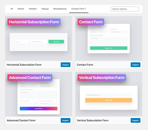
Contact Form 7 tab in Essentials Demo Import Page.
Styling
You can use our custom classes or any default bootstrap classes to customize the forms.
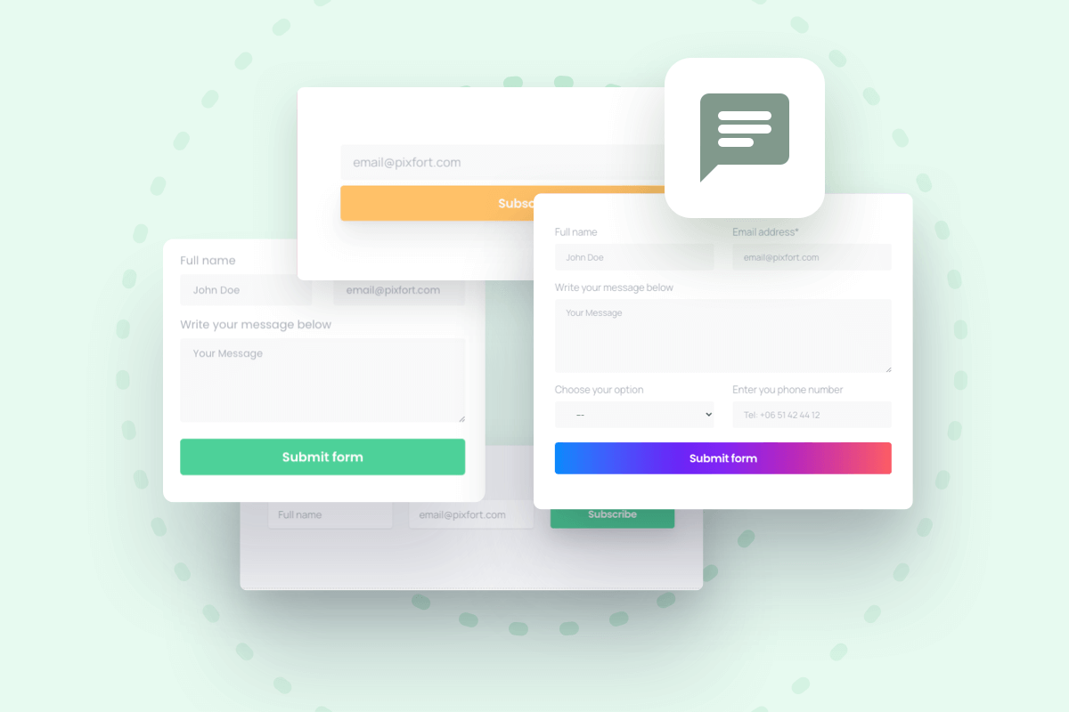
Example
The contact form below is the (Contact Form) in Demo import.
Below you can check the different possibilities of styling the fields and the button.
The code for this form is:
<div class="row">

<div class="col-lg-6"><label class="w-100">Full name
[text* your-name class:pix-my-5 class:shadow-0 class:bg-gray-1 class:form-control placeholder "John Doe"]</label></div>

<div class="col-lg-6"><label class="w-100">Email address*
[email* your-email class:pix-my-5 class:shadow-0 class:bg-gray-1 class:form-control placeholder "email@pixfort.com"]</label></div>

<div class="col-12"><label class="w-100">Write your message below[textarea* your-message x4 class:pix-my-5 class:shadow-0 class:bg-gray-1 class:form-control placeholder "Your Message"]</label></div>
</div>

[submit class:btn class:btn-green class:text-white class:w-100 class:pix-mt-10 class:font-weight-bold class:btn-lg class:shadow-hover "Submit form"]
Field Styling
Example of text field code:
[text* your-name class:pix-my-5 class:shadow-0 class:bg-gray-1 class:form-control placeholder "John Doe"]The text* represents the field type in Contact Form 7 plugin and your-name represents the id of the field.
The background color can be added using the class:bg-COLOR where COLOR should be replaced with a color (view available background color classes), for example a gray background color with opacity level 1:
class:bg-gray-1The box shadow can be added by using one of the theme shadow classes (view available shadow classes), for example shadow-sm for a small shadow. In this contact form example we are not using a shadow, therefore, we are using shadow-0 class to ensure no shadow is applied:
class:shadow-0To control spacing we are using the available spacing classes in the theme (check the spacing section in Custom CSS Classes article):
class:pix-my-5To add a placeholder to your field:
placeholder "John Doe"The class form-control is a bootstrap class for the contact form fields:
class:form-controlTo indicate the Label “Full name” we are using the <label> tag with the class w-100 which makes the fields takes 100% width:
<label class="w-100">Full name
      ... field code here ...
</lable>
For the Textarea field only, the attribute x{NUMBER} represents the number of rows for the field, for example, if you want the height of the textarea field to be 5 rows you can use the attribute x5, for example:
[textarea* your-message x5 class:pix-my-5 class:shadow-0 class:bg-gray-1 class:form-control placeholder "Your Message"]
To change Contact Form 7 field placeholder color, you can add this code snippet into Theme options > Layout > Advanced > Custom css:
.wpcf7 input::placeholder, .wpcf7 textarea::placeholder {
    color: #495057;
}
*You can change the color value depending on your needs.
Vertical Fields
In this contact form example we have 2 fields in the same row, to do this we are using bootstrap classes row which defines a row based on a grid of 12 columns and col-* where * is the number of columns to reserve in this grid, therefore, each of the 2 vertical fields in this example occupies 6 columns in the row.
<div class="row">
      <div class="col-lg-6">
            ... First field here ...
      </div>

      <div class="col-lg-6">
            ... Second field here ...
      </div>
</div>
Note: here we are using col-lg-* which specifies how many columns in large screens only (in medium and small screens it will take the “full row” 12 columns), this could be very useful to specify the width for each screen size.
Important: make sure to correctly close the div and label tags in your form, otherwise, you might have layout issues.
If you are not familiar with Bootstrap grid we recommend you to check it from here.
Button Styling
For the form submit button, the same classes above could be applied:
[submit class:btn class:btn-green class:text-white class:w-100 class:pix-mt-10 class:font-weight-bold class:btn-lg class:shadow-hover "Submit form"]For btn it is a bootstrap class that defines a button and btn-green is a class to make the button green (you can replace green with any available color in the theme):
class:btn class:btn-greenNote: some useful classes for button style:
btn-rounded: makes the button corners rounded.w-100: makes the button takes 100% width.
For more information about using Contact Form 7 you can check the docs on the official website.
