CSS classes can be used to add additional styling to some elements (via several elements in WPBakery or on any element in Elementor).
Essentials is built with Bootstrap 4, so all bootstrap classes can be used, a full list of bootstrap classes are available in bootstrap documentation site.
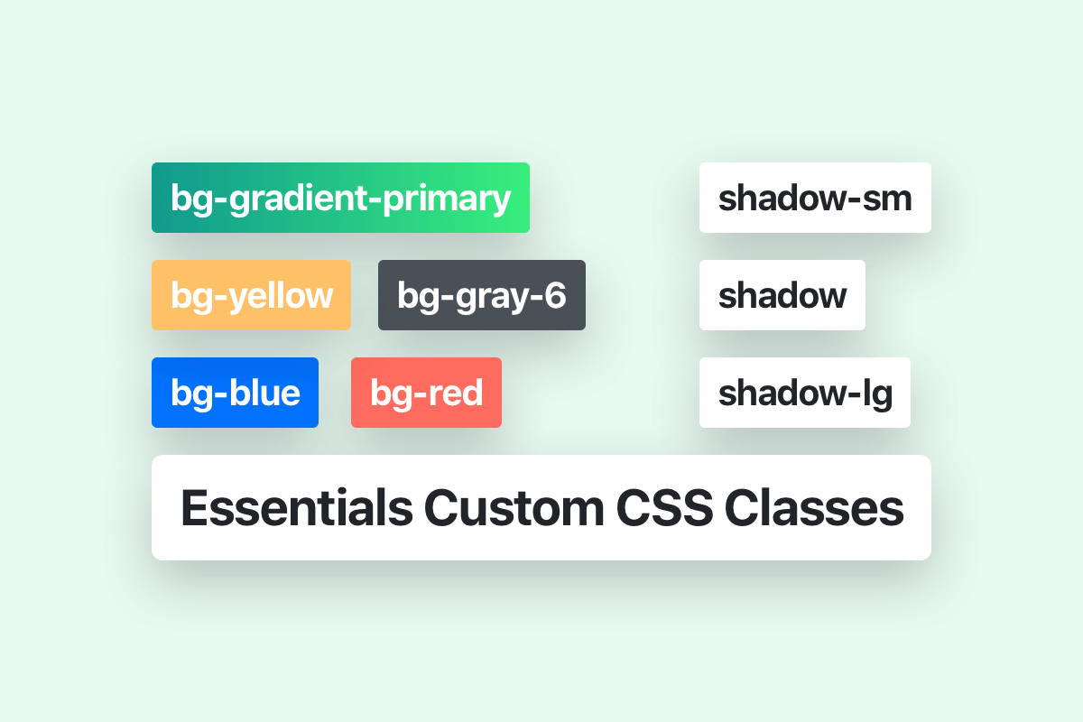
Essentials includes many great CSS styling classes that can be used for more advanced styling in some elements, we will provide here some of the most useful Essentials classes:
Background colors
All background colors classes in Essentials starts with the prefix “bg-” followed by the name of the color for example “green”.
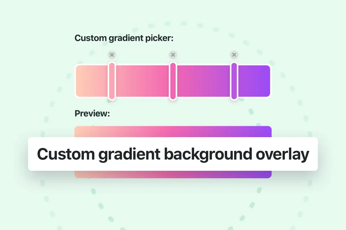
You can use the dynamic colors (that can be changed via theme options) for example:
- The primary gradient background color of the theme.
- bg-primary The primary color of the theme.
- bg-secondary The secondary color of the theme.
Other static colors can be used:
Standard colors:
Light variant colors:
Gray shades:
Dark and Light opacity colors:
Dark and Light Blur:
Text colors
To change the color of the text you can use the available CSS class which start with the prefix “text-” and followed by color name. You can use the same colors listed in the previous background colors section (except the light variant colors) and in addition to the dynamic text colors like “Body default”, “Heading default”, “Primary” and “Secondary” colors which can be changed via theme options:
- For Body color use text-body-default
- For Heading color use text-heading-default
- For Primary color use text-primary
- For Secondary color use text-secondary
Other Static text colors:
- text-white
- text-blue
- text-green
- text-cyan
- text-yellow
- text-orange
- text-red
- text-brown
- text-purple
Text sizes
To change the size of the text you can use the available CSS classes which start with the prefix “text-” and followed by size value or size name.
Below the list of the available classes in the theme:
- For 24px size use text-24
- For 20px size use text-20
- For 18px size use text-18
- For 14px size use text-small
- For 12px size use text-extra-small
If you’re looking to use other text size you can define your own class in the Theme options (Theme options > Layout > Advanced > Custom css), for example:
.text-28 { font-size: 28px !important; line-height: 44px !important; }Animations
Fly small
fly-sm
Fly medium
fly
Fly large
fly-lg
Scale small
scale-sm
Scale medium
scale
Scale large
scale-lg
Scale inverse small
scale-inverse-sm
Scale inverse medium
scale-inverse
Scale inverse large
scale-inverse-lg
Scale in extra small
pix-scale-in-xs
Scale in small
pix-scale-in-sm
Scale in normal
pix-scale-in
Scale in large
pix-scale-in-lg
Rotate

pix-rotating
Rotate inversed
pix-rotating-inverse
Fade
pix-fade
Bounce
Small
pix-bounce-sm
Medium
pix-bounce-md
Large
pix-bounce-lg
Scale
Small
pix-scale-sm
Medium
pix-scale-md
Large
pix-scale-lg
Control infinite animation duration
Slow
pix-duration-slow
Medium
pix-duration-md
Fast
By default
Shadows
Shadow small
shadow-sm
Shadow medium
shadow
Shadow large
shadow-lg
Hover shadow small
shadow-hover-sm
Hover shadow medium
shadow-hover
Hover shadow large
shadow-hover-lg
Inverse Hover shadow small
shadow-inverse-hover-sm
Inverse Hover shadow medium
shadow-inverse-hover
Inverse Hover shadow large
shadow-inverse-hover-lg
To remove the shadow you can use this class: shadow-0
Spacing
How it works:
Assign responsive-friendly margin or padding values to an element or a subset of its sides with shorthand classes. Includes support for individual properties, all properties, and vertical and horizontal properties. Classes are built from a default Sass map ranging from 5px to 200px.
Notation:
The classes are named using the format pix-{property}{sides}-{size}.
For example: to add a 20px horizontal padding we can use the class: pix-px-20.
Where property is one of:
m– for classes that setmarginp– for classes that setpadding
Where sides is one of:
t– for classes that setmargin-toporpadding-topb– for classes that setmargin-bottomorpadding-bottoml– for classes that setmargin-leftorpadding-leftr– for classes that setmargin-rightorpadding-rightx– for classes that set both*-leftand*-righty– for classes that set both*-topand*-bottom- blank – for classes that set a
marginorpaddingon all 4 sides of the element
Where size is one of:
5– (by default) for classes that set themarginorpaddingto5px10– (by default) for classes that set themarginorpaddingto10px...200– (by default) for classes that set themarginorpaddingto200px
The available sizes are: 5, 10, 15, 20, 25, 30, 35, 40, 45, 50, 60, 70, 80, 90, 100, 120, 130, 150, 200.
(You can add more sizes by adding entries to the $spacings Scss map variable.)