
Theme typography settings
You can find the theme typography settings in Theme options > Typography:
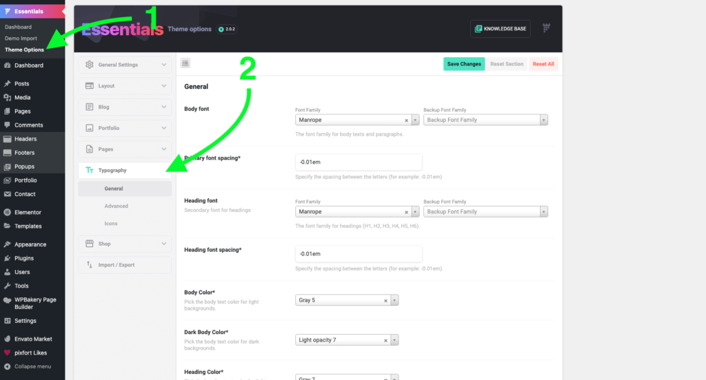
From General tab in Typography you will be able to:
- Choose the Body and Heading font families.
The list of font families are from Google Fonts, if you’re looking to embed external fonts please check this article. - Customize Font spacing.
- Choose Light and Dark font colors.
- Choose Font weight.
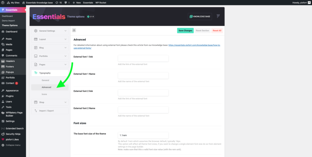
From the Advanced tab in Typography you will be able to:
- Embed external font families.
For information about using external font please check this article. - Override the default font sizes of the theme.
Note: if you’re looking to upload custom fonts to your website you can check this article from our knowledge base.
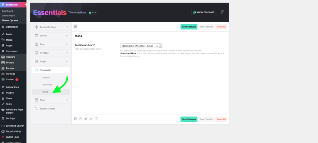
From the Icons tab in Typography you will be able to:
- Choose the size of the font icons in your website.
For performance optimization you can reduce the size of font icons in the website by choosing to load a smaller number of font icons.
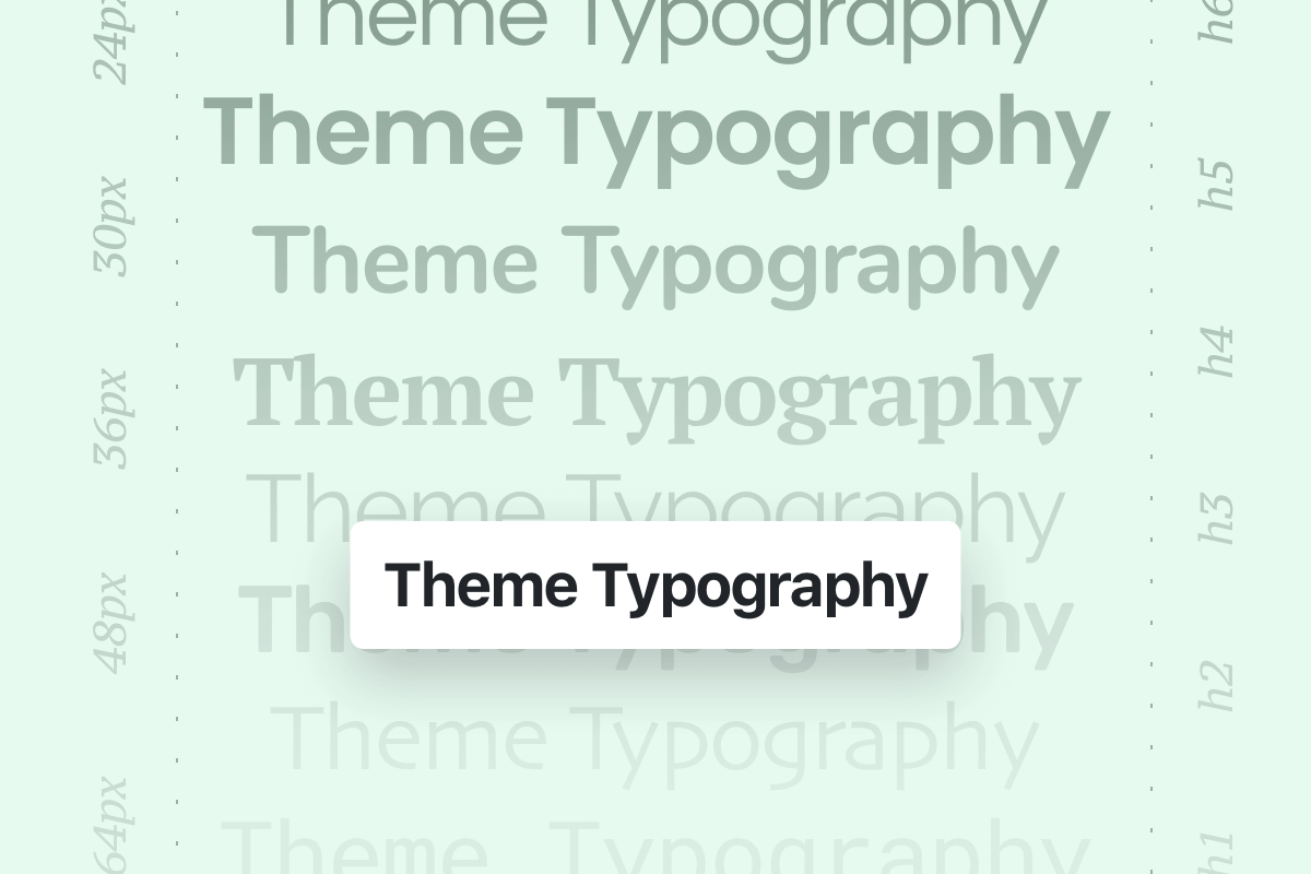
Typography hierarchy
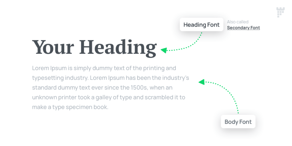
The design system of the theme uses 2 main fonts, Body font and Heading font (also called Secondary font), and all the theme demos are built following this design system:
- The Body font is the base font across your website and it’s also used for longer text, like blog post paragraphs, description text, etc. Therefore, we recommend using an easy-to-read font for your website Body font.
- The Heading font or Secondary font is used as larger, higher impact text, such as in a title or section headings.
Why only 2 fonts? You might ask.
It’s recommended to use no more than 2 fonts in your website since a big part of putting together a good design is making sure the overall look is consistent and the best way to accomplish a consistent look is limiting the number of fonts that you use (you can check online articles concerning this topic, for example this article).
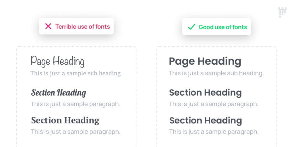
Also it’s not recommended to use more than 2 fonts in a page to avoid loading additional files which affects the website loading speed, in addition to that, it’s important to mention that using multiple weights for each font will require loading additional file for each font weight and this also affects the website loading speed.
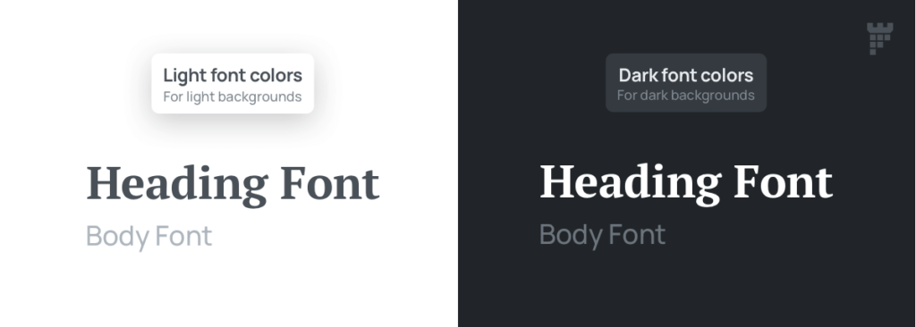
Main Typography colors
The design system of the theme uses 2 main font color schemes for Body font and Heading font, the Light font colors (Default) and the Dark font colors, these font colors can be set from Theme option > Typography > General tab, where you can choose colors from the Theme colors or set custom colors.
- Light font colors (Body Color and Heading Color) : are the base font colors for Body and Heading fonts used by default across your website, and it’s mainly used for text with light background.
- Dark font colors (Dark Body Color and Dark Heading Color): are special colors used for text with dark background, the option to use dark colors is only available in specific places in the theme, especially for parts that can’t be controlled via the page builder (like the intro section, pixfort Widgets, etc.).
Note: At the moment the Dark mode switch option is not available in the theme, however, we will try to add it in future updates.
Note
In addition to the main typography colors (light and dark font colors), it’s possible to choose colors from the Theme Colors or a custom color for texts in most parts of the theme, like in pixfort Elements in the page builders (WPBakery and Elementor), Header Builder, etc.
For more information on the Theme colors and how to change them you can check this article:


